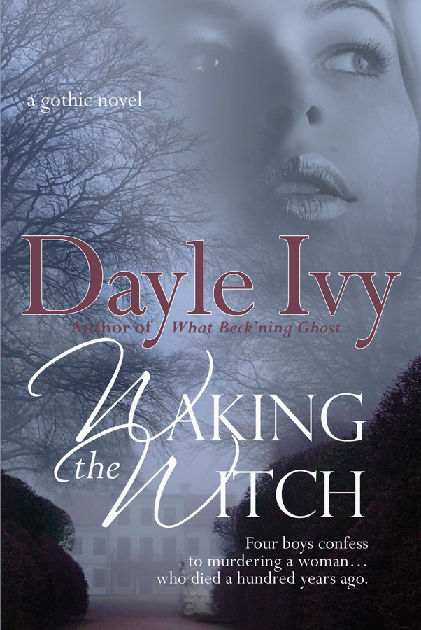
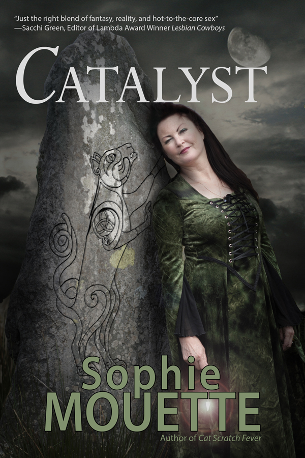
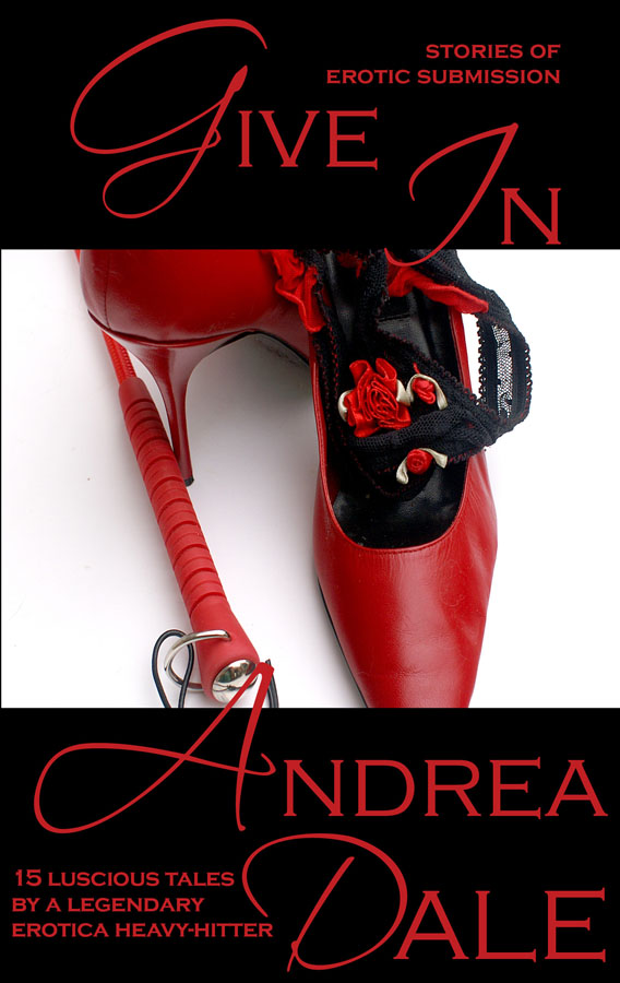
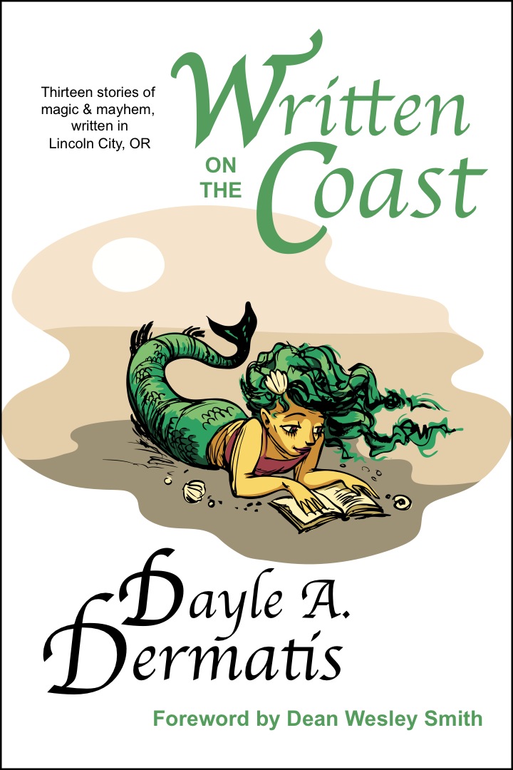
Thank you to everyone who commented in my cover poll! Cover A won out, and in fact the more I thought about it, the more I preferred it. Emerald really nailed it when she said "it seems to represent the abundant decorations in the story more." Excess is what the story is all about...thank you, Emerald, for reminding me of that!
But many of you also said my name was difficult to read on Cover A, so we've tweaked that. Does the New Cover A work better? I think the different color makes the name pop a lot more, as does the shading (looks like snow-capped letters!), especially at a thumbnail size.
New Cover A
Old Cover A
~~
"She has so many aliases, you'd think she was a spy!"
~~
Wednesday, December 01, 2010
Subscribe to:
Comments (Atom)


