Subscribe to:
Post Comments (Atom)

About Me

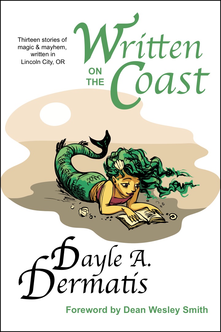
- Dayle A. Dermatis
- DAYLE A. DERMATIS has been called “one of the best writers working today” by USA Today bestselling author Dean Wesley Smith. Under various pseudonyms (and sometimes with coauthors), she’s sold several novels and more than 100 short stories in multiple genres. She lives and works in California within scent of the ocean, and in her spare time follows Styx around the country and travels the world, all of which inspires her writing. She loves music, cats, Wales, TV, magic, laughter, and defying expectations. To find out where she is today, check out www.DayleDermatis.com.
Tweets Ahoy!
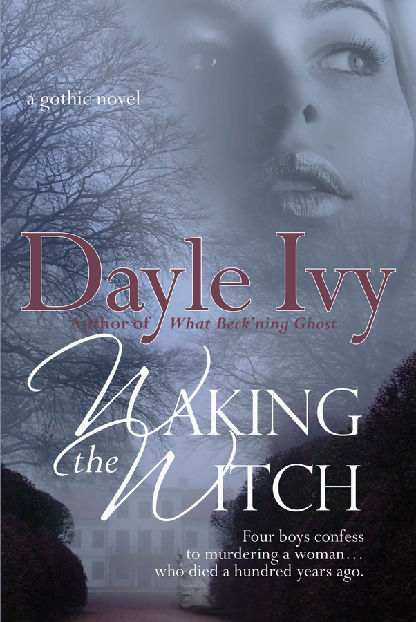
Waking the Witch
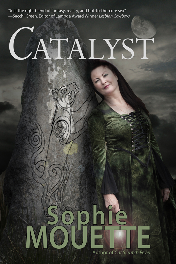
Catalyst
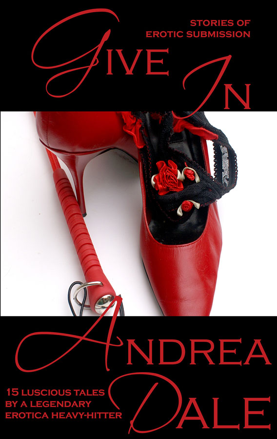
Give In: Stories of Erotic Submission
Written on the Coast
Links
Blog Archive
-
►
2014
(9)
- ► 03/02 - 03/09 (3)
- ► 02/02 - 02/09 (1)
- ► 01/26 - 02/02 (1)
- ► 01/19 - 01/26 (3)
- ► 01/05 - 01/12 (1)
-
►
2013
(62)
- ► 12/29 - 01/05 (1)
- ► 12/08 - 12/15 (3)
- ► 12/01 - 12/08 (3)
- ► 11/24 - 12/01 (1)
- ► 11/03 - 11/10 (3)
- ► 10/27 - 11/03 (1)
- ► 10/20 - 10/27 (1)
- ► 10/13 - 10/20 (3)
- ► 10/06 - 10/13 (1)
- ► 09/01 - 09/08 (1)
- ► 08/18 - 08/25 (2)
- ► 07/28 - 08/04 (1)
- ► 07/07 - 07/14 (2)
- ► 06/30 - 07/07 (4)
- ► 06/23 - 06/30 (2)
- ► 06/16 - 06/23 (2)
- ► 06/09 - 06/16 (2)
- ► 06/02 - 06/09 (4)
- ► 05/26 - 06/02 (2)
- ► 05/19 - 05/26 (4)
- ► 05/12 - 05/19 (1)
- ► 05/05 - 05/12 (3)
- ► 03/24 - 03/31 (2)
- ► 03/17 - 03/24 (2)
- ► 03/03 - 03/10 (2)
- ► 02/24 - 03/03 (1)
- ► 02/17 - 02/24 (3)
- ► 01/27 - 02/03 (2)
- ► 01/20 - 01/27 (1)
- ► 01/13 - 01/20 (2)
-
►
2012
(71)
- ► 12/30 - 01/06 (2)
- ► 12/23 - 12/30 (2)
- ► 12/16 - 12/23 (3)
- ► 12/09 - 12/16 (5)
- ► 12/02 - 12/09 (2)
- ► 11/04 - 11/11 (2)
- ► 10/14 - 10/21 (1)
- ► 10/07 - 10/14 (3)
- ► 09/23 - 09/30 (1)
- ► 09/16 - 09/23 (1)
- ► 09/02 - 09/09 (2)
- ► 08/26 - 09/02 (1)
- ► 08/12 - 08/19 (1)
- ► 08/05 - 08/12 (3)
- ► 07/29 - 08/05 (3)
- ► 07/15 - 07/22 (1)
- ► 07/01 - 07/08 (1)
- ► 06/24 - 07/01 (1)
- ► 06/17 - 06/24 (1)
- ► 06/10 - 06/17 (1)
- ► 06/03 - 06/10 (1)
- ► 05/13 - 05/20 (2)
- ► 05/06 - 05/13 (4)
- ► 04/29 - 05/06 (2)
- ► 04/22 - 04/29 (3)
- ► 04/15 - 04/22 (4)
- ► 04/08 - 04/15 (1)
- ► 03/18 - 03/25 (1)
- ► 03/11 - 03/18 (2)
- ► 02/12 - 02/19 (1)
- ► 02/05 - 02/12 (4)
- ► 01/29 - 02/05 (3)
- ► 01/22 - 01/29 (2)
- ► 01/15 - 01/22 (1)
- ► 01/08 - 01/15 (3)
-
►
2011
(111)
- ► 12/25 - 01/01 (3)
- ► 12/11 - 12/18 (1)
- ► 11/20 - 11/27 (1)
- ► 11/13 - 11/20 (2)
- ► 11/06 - 11/13 (3)
- ► 10/30 - 11/06 (3)
- ► 10/16 - 10/23 (2)
- ► 10/09 - 10/16 (2)
- ► 09/25 - 10/02 (1)
- ► 09/18 - 09/25 (2)
- ► 09/11 - 09/18 (1)
- ► 08/28 - 09/04 (6)
- ► 08/21 - 08/28 (3)
- ► 08/14 - 08/21 (2)
- ► 08/07 - 08/14 (1)
- ► 07/31 - 08/07 (2)
- ► 07/24 - 07/31 (2)
- ► 07/17 - 07/24 (4)
- ► 07/10 - 07/17 (7)
- ► 07/03 - 07/10 (6)
- ► 06/26 - 07/03 (2)
- ► 06/12 - 06/19 (3)
- ► 05/29 - 06/05 (4)
- ► 05/22 - 05/29 (2)
- ► 05/15 - 05/22 (5)
- ► 05/01 - 05/08 (4)
- ► 04/24 - 05/01 (5)
- ► 04/17 - 04/24 (4)
- ► 04/10 - 04/17 (3)
- ► 04/03 - 04/10 (2)
- ► 03/27 - 04/03 (2)
- ► 03/20 - 03/27 (1)
- ► 03/13 - 03/20 (3)
- ► 03/06 - 03/13 (1)
- ► 02/27 - 03/06 (2)
- ► 02/20 - 02/27 (1)
- ► 01/30 - 02/06 (3)
- ► 01/16 - 01/23 (3)
- ► 01/09 - 01/16 (3)
- ► 01/02 - 01/09 (4)
-
►
2010
(126)
- ► 12/26 - 01/02 (1)
- ► 12/12 - 12/19 (3)
- ► 12/05 - 12/12 (2)
- ► 11/28 - 12/05 (1)
- ► 11/21 - 11/28 (3)
- ► 11/14 - 11/21 (2)
- ► 11/07 - 11/14 (2)
- ► 10/31 - 11/07 (2)
- ► 10/24 - 10/31 (2)
- ► 10/10 - 10/17 (3)
- ► 09/26 - 10/03 (7)
- ► 09/19 - 09/26 (3)
- ► 09/12 - 09/19 (3)
- ► 08/15 - 08/22 (4)
- ► 08/08 - 08/15 (3)
- ► 08/01 - 08/08 (2)
- ► 07/25 - 08/01 (2)
- ► 07/18 - 07/25 (3)
- ► 07/11 - 07/18 (1)
- ► 07/04 - 07/11 (4)
- ► 06/27 - 07/04 (4)
- ► 06/20 - 06/27 (3)
- ► 06/13 - 06/20 (4)
- ► 06/06 - 06/13 (2)
- ► 05/30 - 06/06 (2)
- ► 05/23 - 05/30 (2)
- ► 05/16 - 05/23 (1)
- ► 05/09 - 05/16 (2)
- ► 05/02 - 05/09 (4)
- ► 04/25 - 05/02 (2)
- ► 04/18 - 04/25 (4)
- ► 04/11 - 04/18 (1)
- ► 04/04 - 04/11 (5)
- ► 03/28 - 04/04 (5)
- ► 03/21 - 03/28 (2)
- ► 03/14 - 03/21 (2)
- ► 03/07 - 03/14 (6)
- ► 02/28 - 03/07 (3)
- ► 02/21 - 02/28 (4)
- ► 02/14 - 02/21 (4)
- ► 02/07 - 02/14 (2)
- ► 01/31 - 02/07 (5)
- ► 01/24 - 01/31 (1)
- ► 01/17 - 01/24 (3)
-
►
2009
(140)
- ► 12/20 - 12/27 (4)
- ► 12/13 - 12/20 (2)
- ► 12/06 - 12/13 (4)
- ► 11/22 - 11/29 (1)
- ► 11/15 - 11/22 (2)
- ► 11/08 - 11/15 (3)
- ► 11/01 - 11/08 (3)
- ► 10/25 - 11/01 (2)
- ► 10/11 - 10/18 (2)
- ► 10/04 - 10/11 (1)
- ► 09/20 - 09/27 (2)
- ► 09/06 - 09/13 (5)
- ► 08/30 - 09/06 (4)
- ► 08/23 - 08/30 (4)
- ► 08/16 - 08/23 (2)
- ► 08/09 - 08/16 (1)
- ► 08/02 - 08/09 (3)
- ► 07/26 - 08/02 (3)
- ► 07/19 - 07/26 (8)
- ► 07/12 - 07/19 (3)
- ► 07/05 - 07/12 (1)
- ► 06/28 - 07/05 (2)
- ► 06/21 - 06/28 (2)
- ► 06/14 - 06/21 (2)
- ► 06/07 - 06/14 (3)
- ► 05/31 - 06/07 (2)
- ► 05/24 - 05/31 (5)
- ► 05/10 - 05/17 (3)
- ► 05/03 - 05/10 (4)
- ► 04/26 - 05/03 (5)
- ► 04/19 - 04/26 (3)
- ► 04/12 - 04/19 (8)
- ► 04/05 - 04/12 (3)
- ► 03/29 - 04/05 (1)
- ► 03/22 - 03/29 (4)
- ► 03/15 - 03/22 (3)
- ► 03/08 - 03/15 (1)
- ► 03/01 - 03/08 (3)
- ► 02/22 - 03/01 (3)
- ► 02/15 - 02/22 (3)
- ► 02/08 - 02/15 (1)
- ► 02/01 - 02/08 (6)
- ► 01/25 - 02/01 (4)
- ► 01/18 - 01/25 (2)
- ► 01/11 - 01/18 (4)
- ► 01/04 - 01/11 (3)
-
▼
2008
(215)
- ► 12/28 - 01/04 (6)
- ► 12/21 - 12/28 (4)
- ► 12/14 - 12/21 (4)
- ► 12/07 - 12/14 (4)
- ► 11/30 - 12/07 (2)
- ► 11/23 - 11/30 (3)
- ► 11/16 - 11/23 (6)
- ► 11/09 - 11/16 (4)
- ► 11/02 - 11/09 (1)
- ► 10/26 - 11/02 (3)
- ► 10/19 - 10/26 (6)
- ► 10/12 - 10/19 (5)
- ► 10/05 - 10/12 (3)
- ► 09/28 - 10/05 (3)
- ► 09/21 - 09/28 (6)
- ► 09/14 - 09/21 (6)
- ► 09/07 - 09/14 (4)
- ► 08/31 - 09/07 (4)
- ► 08/24 - 08/31 (2)
- ► 08/17 - 08/24 (6)
- ► 08/10 - 08/17 (2)
- ► 08/03 - 08/10 (3)
- ► 07/20 - 07/27 (5)
- ► 07/13 - 07/20 (3)
- ► 07/06 - 07/13 (6)
- ► 06/29 - 07/06 (6)
- ► 06/22 - 06/29 (6)
- ► 06/15 - 06/22 (4)
- ► 06/08 - 06/15 (4)
- ► 06/01 - 06/08 (2)
- ► 05/25 - 06/01 (2)
- ► 05/18 - 05/25 (2)
- ► 05/11 - 05/18 (3)
- ► 04/27 - 05/04 (2)
- ► 04/20 - 04/27 (3)
- ► 04/13 - 04/20 (3)
- ► 04/06 - 04/13 (4)
- ► 03/30 - 04/06 (6)
- ► 03/23 - 03/30 (5)
- ► 03/16 - 03/23 (7)
- ► 03/09 - 03/16 (2)
- ► 03/02 - 03/09 (7)
- ► 02/24 - 03/02 (7)
- ► 02/17 - 02/24 (6)
- ► 02/10 - 02/17 (5)
- ▼ 02/03 - 02/10 (5)
- ► 01/27 - 02/03 (5)
- ► 01/20 - 01/27 (5)
- ► 01/13 - 01/20 (6)
- ► 01/06 - 01/13 (7)
-
►
2007
(148)
- ► 12/30 - 01/06 (4)
- ► 12/23 - 12/30 (5)
- ► 12/16 - 12/23 (4)
- ► 12/09 - 12/16 (2)
- ► 12/02 - 12/09 (5)
- ► 11/25 - 12/02 (2)
- ► 11/18 - 11/25 (5)
- ► 11/11 - 11/18 (4)
- ► 11/04 - 11/11 (3)
- ► 10/28 - 11/04 (6)
- ► 10/21 - 10/28 (7)
- ► 10/14 - 10/21 (2)
- ► 10/07 - 10/14 (6)
- ► 09/30 - 10/07 (3)
- ► 09/23 - 09/30 (2)
- ► 09/16 - 09/23 (3)
- ► 09/09 - 09/16 (6)
- ► 09/02 - 09/09 (6)
- ► 08/26 - 09/02 (3)
- ► 08/19 - 08/26 (4)
- ► 08/12 - 08/19 (2)
- ► 08/05 - 08/12 (4)
- ► 07/29 - 08/05 (3)
- ► 07/22 - 07/29 (2)
- ► 07/15 - 07/22 (4)
- ► 07/08 - 07/15 (2)
- ► 06/24 - 07/01 (2)
- ► 06/17 - 06/24 (2)
- ► 06/10 - 06/17 (3)
- ► 06/03 - 06/10 (3)
- ► 05/27 - 06/03 (1)
- ► 05/20 - 05/27 (3)
- ► 04/29 - 05/06 (3)
- ► 04/15 - 04/22 (1)
- ► 04/01 - 04/08 (1)
- ► 03/25 - 04/01 (3)
- ► 03/18 - 03/25 (4)
- ► 03/11 - 03/18 (4)
- ► 02/25 - 03/04 (1)
- ► 02/18 - 02/25 (2)
- ► 02/11 - 02/18 (2)
- ► 02/04 - 02/11 (4)
- ► 01/28 - 02/04 (2)
- ► 01/21 - 01/28 (2)
- ► 01/14 - 01/21 (3)
- ► 01/07 - 01/14 (3)
-
►
2006
(46)
- ► 12/31 - 01/07 (4)
- ► 12/24 - 12/31 (1)
- ► 12/17 - 12/24 (2)
- ► 12/10 - 12/17 (1)
- ► 12/03 - 12/10 (2)
- ► 11/26 - 12/03 (2)
- ► 11/19 - 11/26 (2)
- ► 11/12 - 11/19 (2)
- ► 11/05 - 11/12 (1)
- ► 10/29 - 11/05 (2)
- ► 10/22 - 10/29 (1)
- ► 10/15 - 10/22 (2)
- ► 10/08 - 10/15 (1)
- ► 10/01 - 10/08 (3)
- ► 09/24 - 10/01 (2)
- ► 09/17 - 09/24 (2)
- ► 09/10 - 09/17 (3)
- ► 09/03 - 09/10 (2)
- ► 08/27 - 09/03 (1)
- ► 08/20 - 08/27 (2)
- ► 08/13 - 08/20 (2)
- ► 08/06 - 08/13 (3)
- ► 07/30 - 08/06 (3)
Labels
- 1980s (1)
- Adirondacks (3)
- admin (1)
- adventures (1)
- ahhh (1)
- alison tyler (11)
- ALNM (13)
- Andrea Dale (116)
- Andrea Loewen (1)
- Angelika (3)
- anthologies (64)
- appearances (7)
- Aquarium of the Pacific (1)
- awards (2)
- being present (1)
- birthday (15)
- Boise (4)
- book signing (2)
- books (7)
- Bound by Lust (1)
- cats (23)
- CCR (5)
- charity anthology (1)
- Christmas (2)
- Circlet Press (6)
- Cleis Press (29)
- collections (6)
- Coming Together charity anthologies (7)
- concerts (1)
- contest (1)
- conversations (1)
- cooking (6)
- copyediting (8)
- covers (4)
- CSF (4)
- Custom Erotica Source (11)
- Day After Daze (2)
- Dayle A. Dermatis (28)
- Dayle Ivy (6)
- DayleDermatis.com (1)
- decorating (3)
- Dirty Girls (1)
- diverticulitis (1)
- dreams (3)
- e-stories (27)
- ebooks (2)
- editing (1)
- erotica (60)
- euphoria (2)
- exercise (1)
- fairy tales (1)
- family (26)
- fantasy (35)
- fear (1)
- Fiction River (2)
- focus (2)
- food (16)
- foreign sale (4)
- frack (1)
- free story (2)
- friends (30)
- funny (6)
- geek (8)
- genealogy (1)
- Ghosted (11)
- ghosts (1)
- giveaway (1)
- goals (2)
- Gothic (2)
- gowan (7)
- guest blog (3)
- gym (3)
- hair (1)
- Halloween (4)
- hand (2)
- harlequin spice (2)
- heal (1)
- health (24)
- herbal (1)
- High Spirits (2)
- holiday (4)
- home (12)
- house (13)
- IBR (25)
- In the Flesh (5)
- inspiration (4)
- joy (2)
- Keene (1)
- Ken (80)
- Kendra Wayne (4)
- Kindle (3)
- Kristina Wright (4)
- kudos (4)
- LARA (6)
- LDR (2)
- life (265)
- Little Kisses Press (11)
- LP Press (1)
- Lucky Bat Books (3)
- Lust Bites (13)
- Managing Editor (1)
- meerkats (3)
- moon (1)
- motivation (3)
- motorcycle (31)
- moving (1)
- music (18)
- mythic fiction (1)
- New Year's Eve (1)
- Nook (2)
- novel (3)
- NY (2)
- ocean (3)
- OCW (20)
- office (3)
- OOTFP (13)
- Oregon (20)
- Oregon Writers Network (20)
- ow (2)
- photos (18)
- Plattsburgh (2)
- playlists (1)
- podcast (1)
- poll (4)
- print books (4)
- projects (4)
- promo (79)
- publication (9)
- publications (10)
- publishing (10)
- PUM (7)
- Queen Mary (2)
- question for the masses (21)
- Rachel Kramer Bussel (11)
- random trivia (1)
- reading (7)
- recap (1)
- recommended reading (8)
- research (1)
- reviews (10)
- romance (9)
- RWA (2)
- Sacchi Green (3)
- sale (41)
- Sarah Dale (2)
- SCA (55)
- sewing (1)
- Shanna Germain (3)
- short story (22)
- silly (1)
- Smashwords (2)
- Sophie Mouette (33)
- Soul's Road Press (57)
- steampunk (1)
- Styx (43)
- sushi (1)
- SWD (1)
- tattoo (2)
- tea (4)
- teaching (1)
- Teresa Noelle Roberts (12)
- the good (1)
- the good catches up (5)
- the wheel turns (1)
- Thursday Thirteen (19)
- To Do (6)
- toys (1)
- travel (102)
- TV (4)
- Violet Blue (4)
- Waking the Witch (8)
- WBG (1)
- website (1)
- wine (1)
- winter (1)
- wishes (2)
- Work-for-Hire (1)
- writing (296)
- WSWL (2)
- Yule (5)
- zoo (1)
Followers
copyright 2010 Dayle A. Dermatis
5 comments:
Pleasant and easy on the eyes. And the color on the sides reminds me of chocolate (at least on my computer it does). It's good!
If this makes no sense, remember it's early here!
It's pretty and very easy to read, which is major.
The brown looks very late Victorian/Craftsman, with the subtle patterning. Especially with the green, it also looks very natural and somehow spiritual. I like the look because it's very you. My own question is whether it's a good marketing look for what you write, which doesn't tend to be "cozy" or Victorian? (OTOH, I know I plan to go with a color scheme that suits me rather than attempting something "red hot" that I'd get tired of seeing all time, so maybe it makes perfect sense.)
I just think it's really purty. :P
Well, they don't have a template for ivy yet, and the previous template--which was closest to the color palate I want--had the sucky "light lettering on a dark background" that's nearly impossible to read. (With my poor eyesight, I've gotten to the point where I either need to bump up those blogs/sites to a huge font size, or avoid them altogether.) I figured the brown would be a neutral color to add the greens to.
And I prefer to think of the bawdy Victorians rather than the cozy ones!
I like it! I like it! :)
Post a Comment